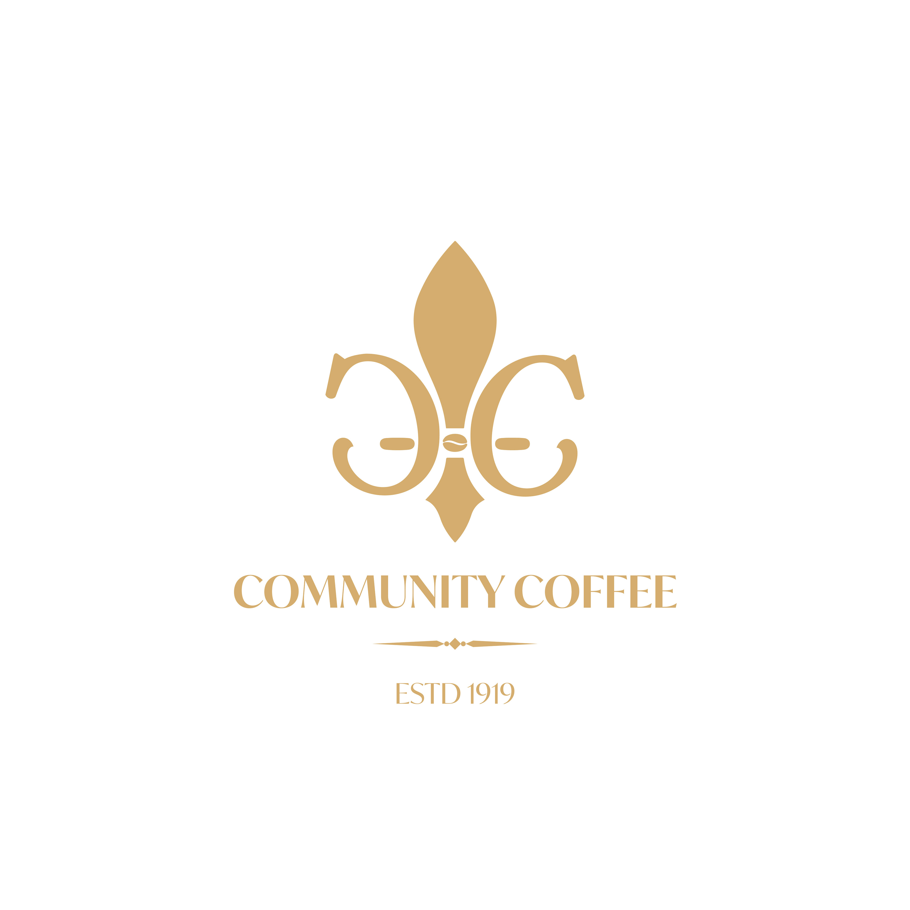
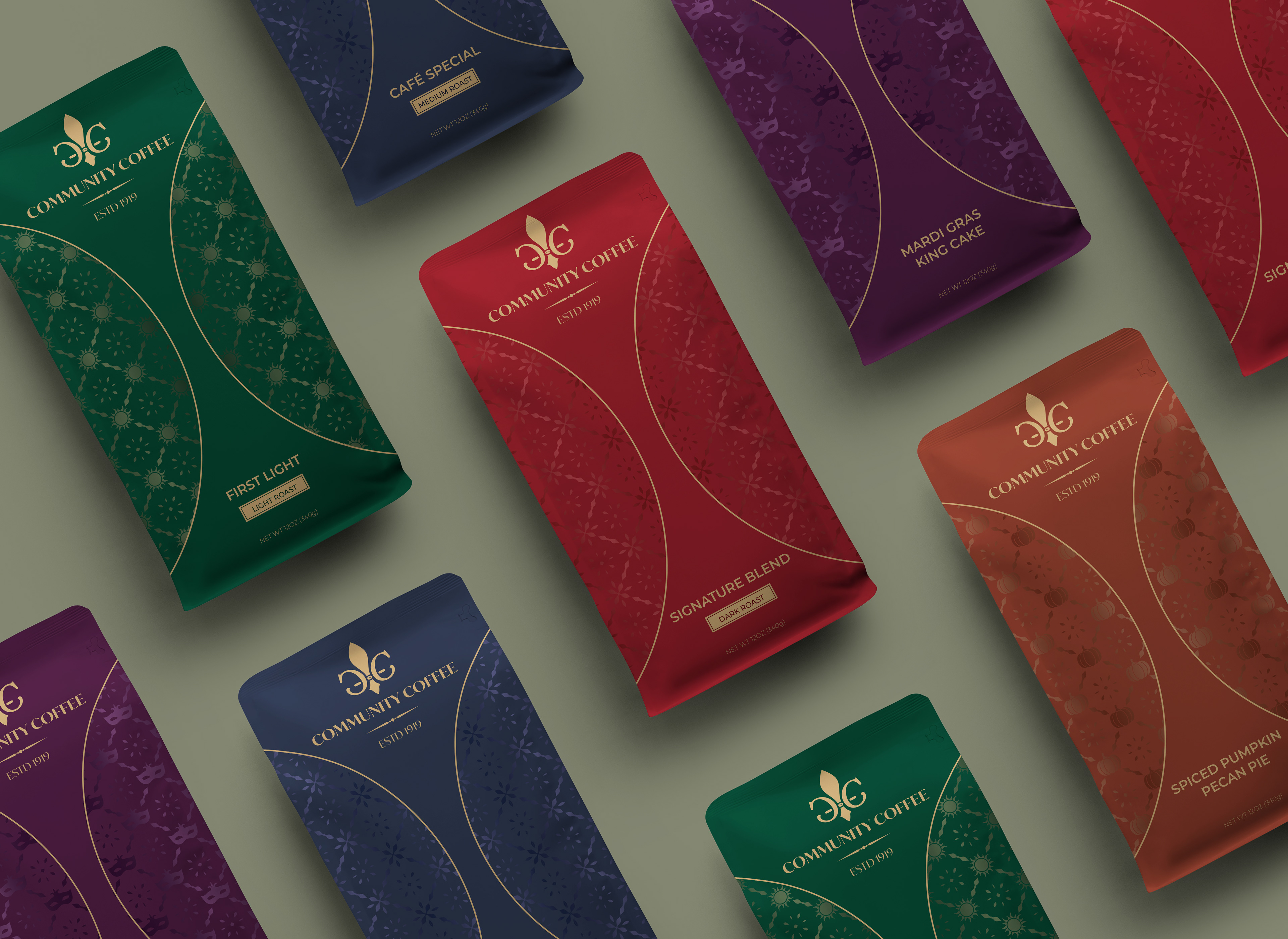
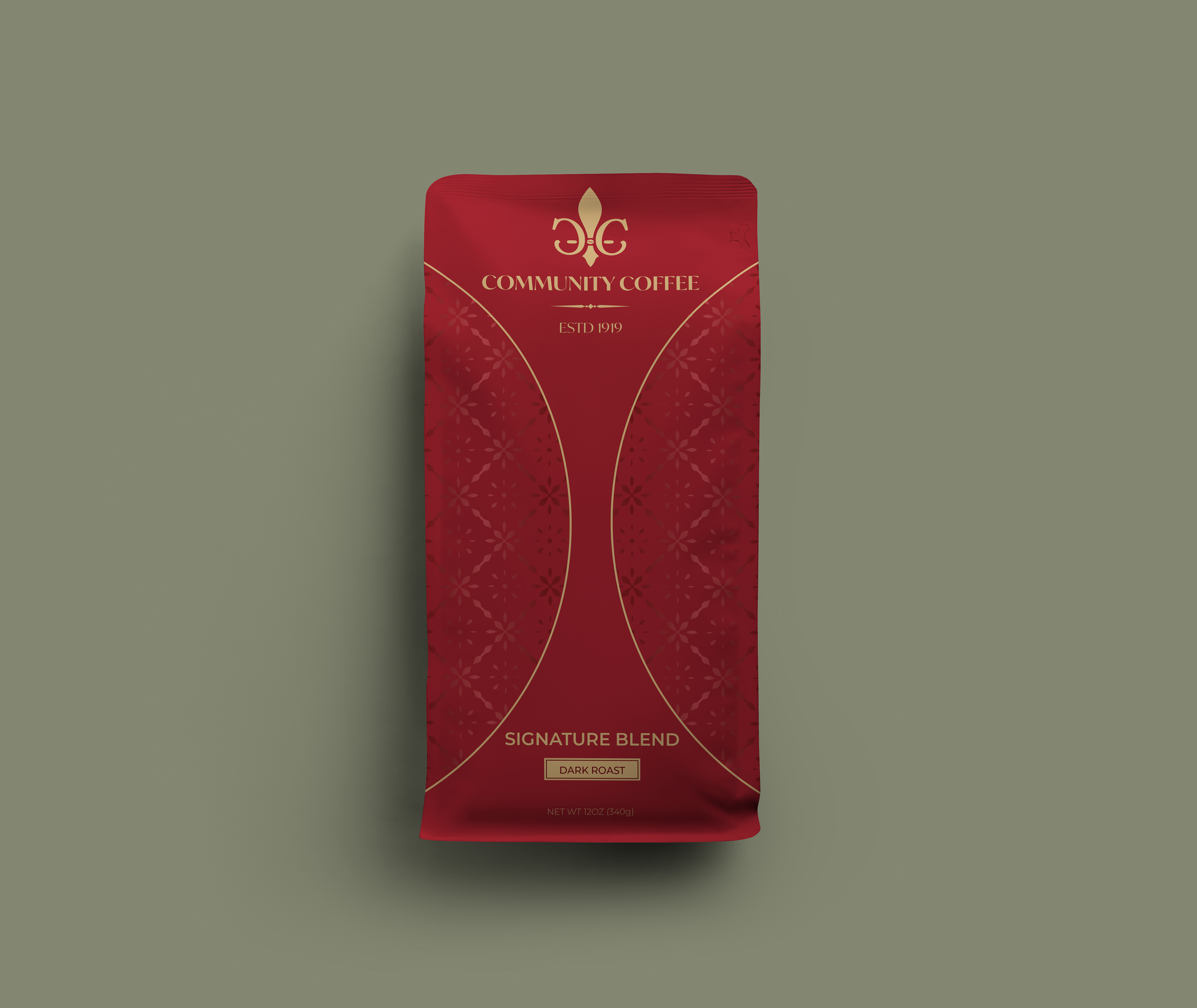
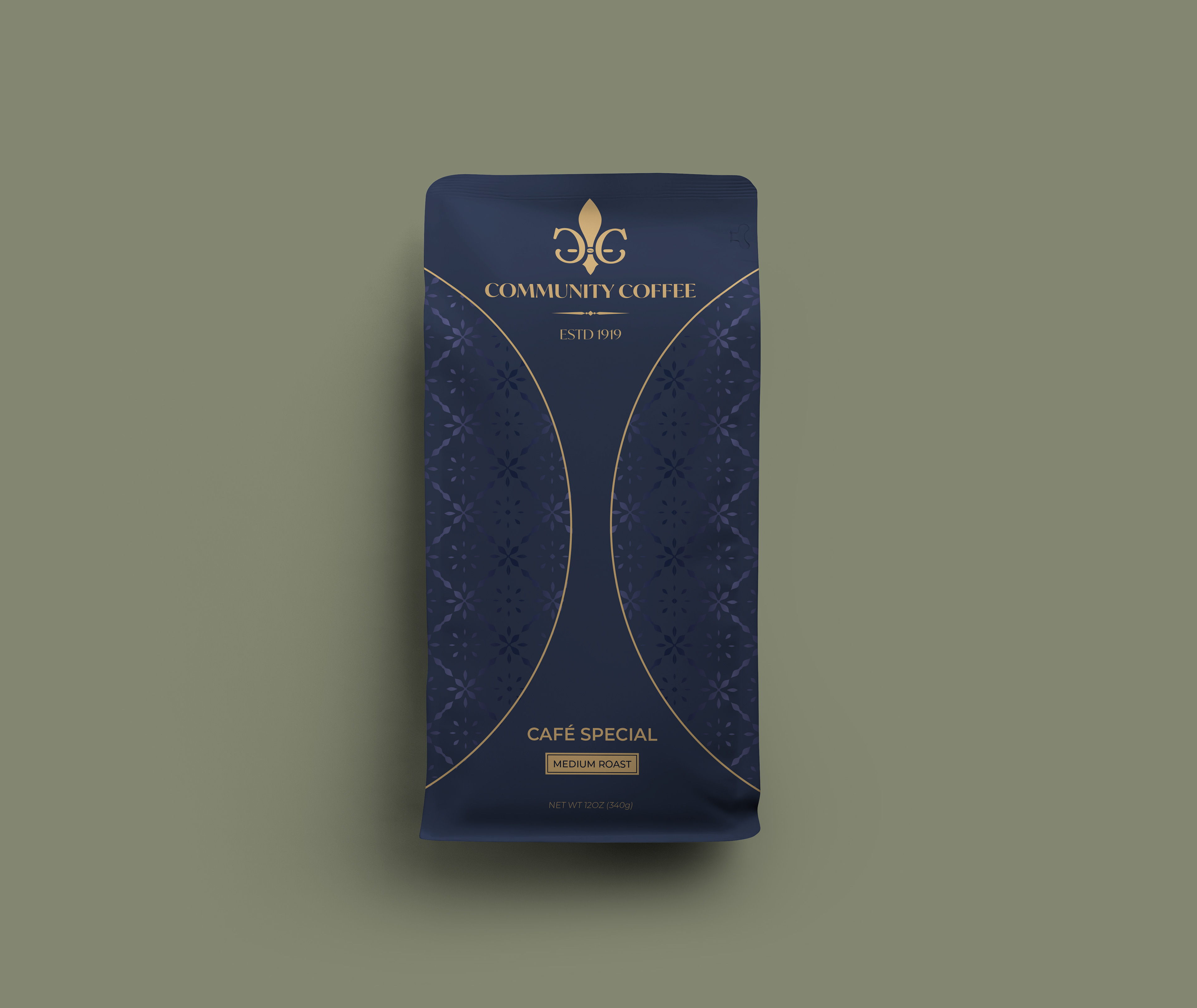
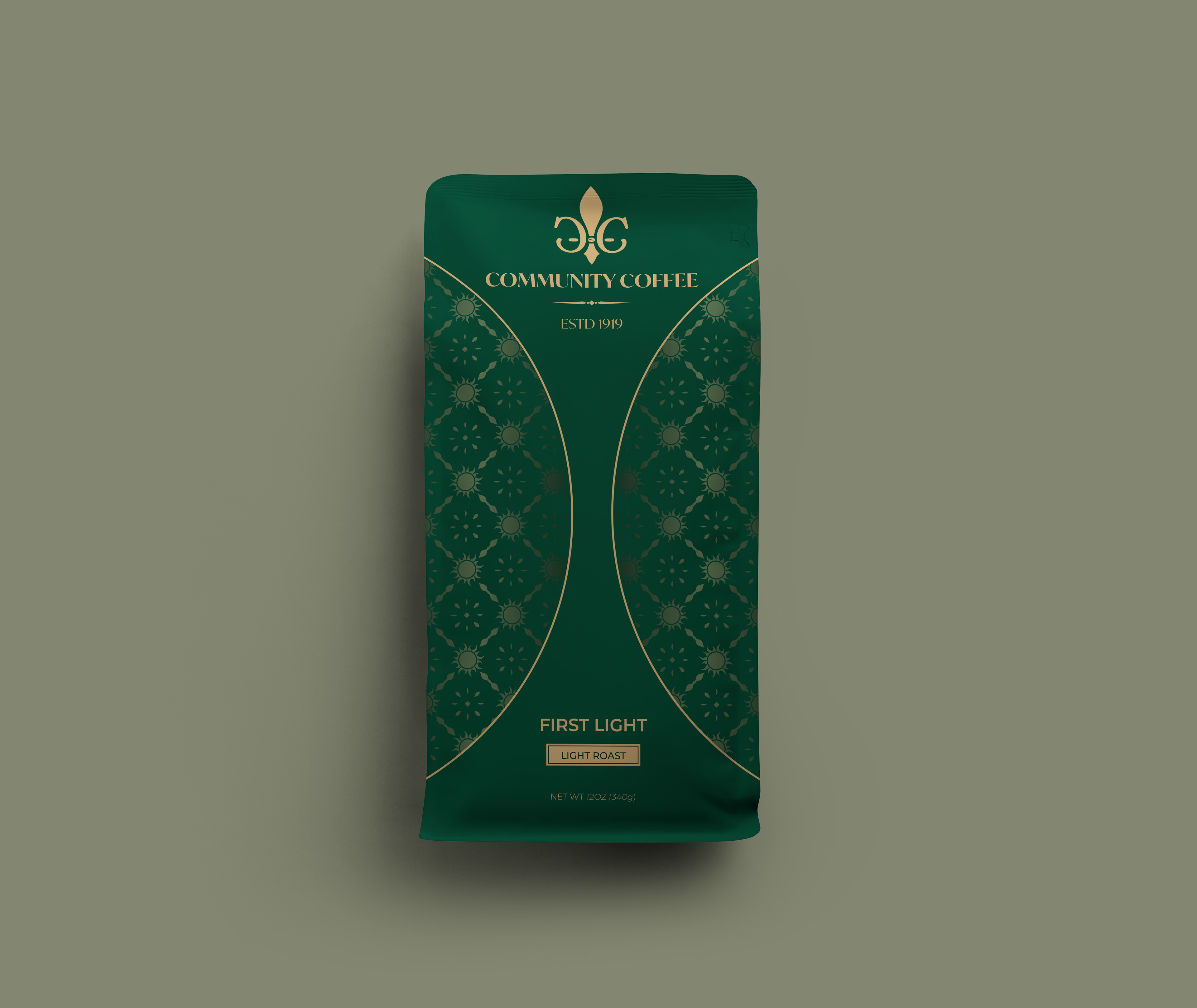
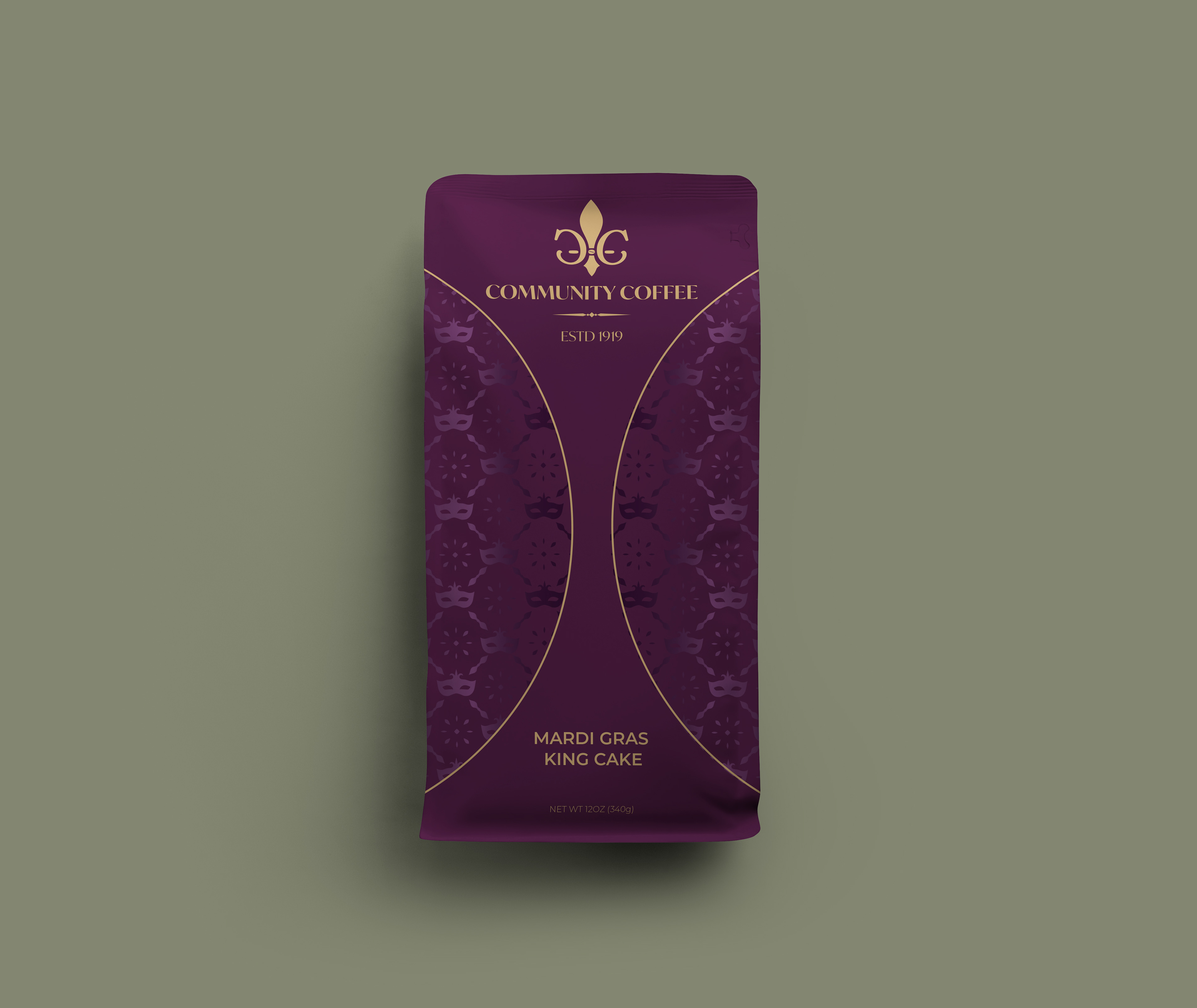
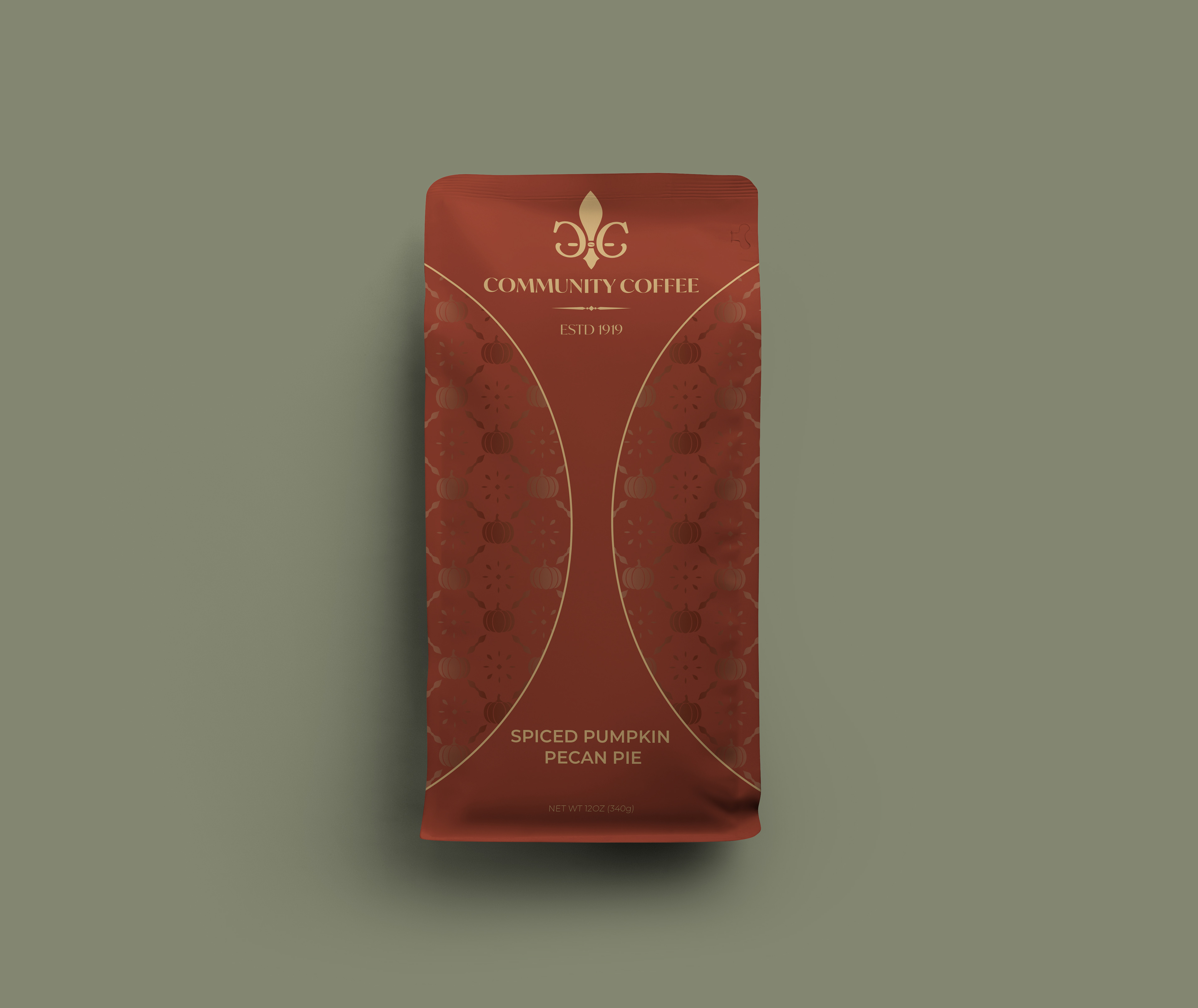
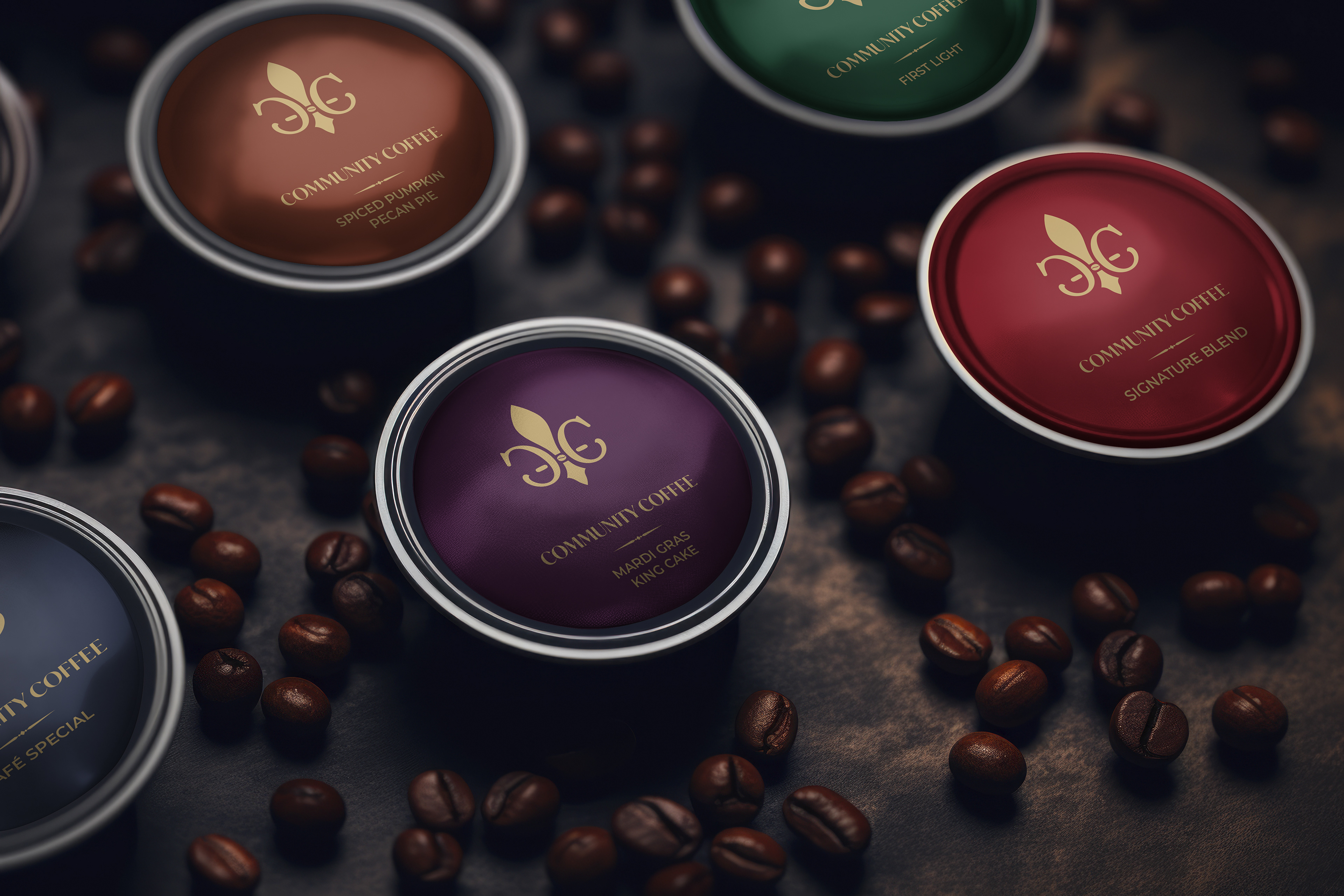
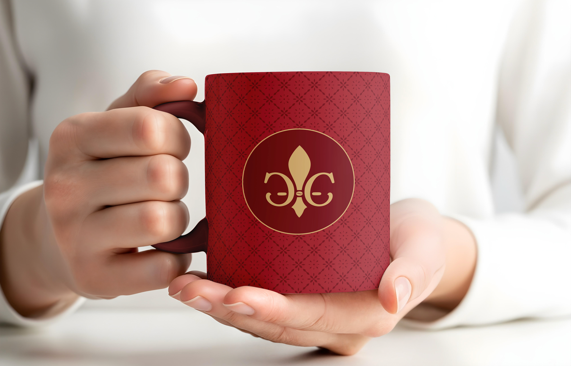
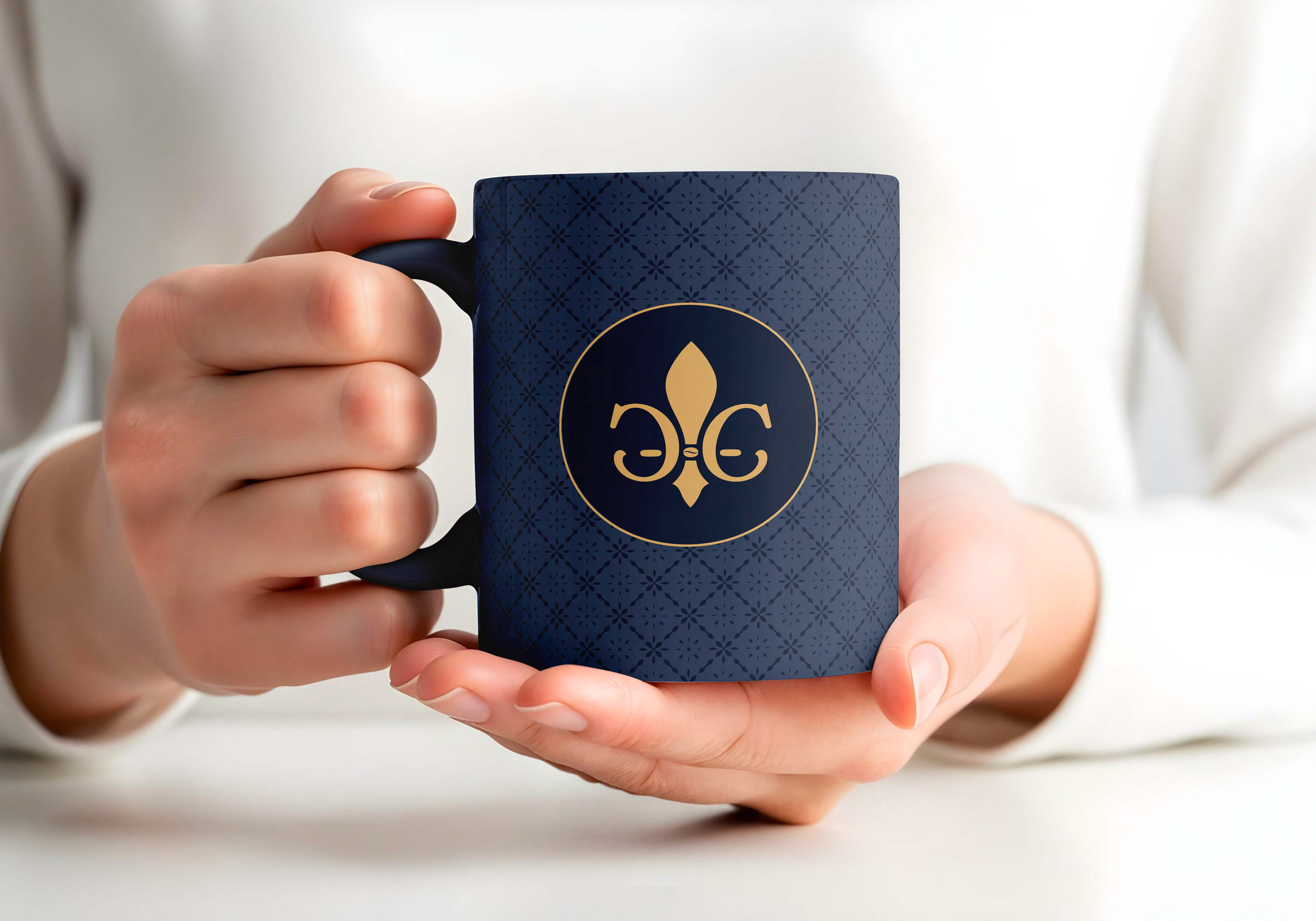
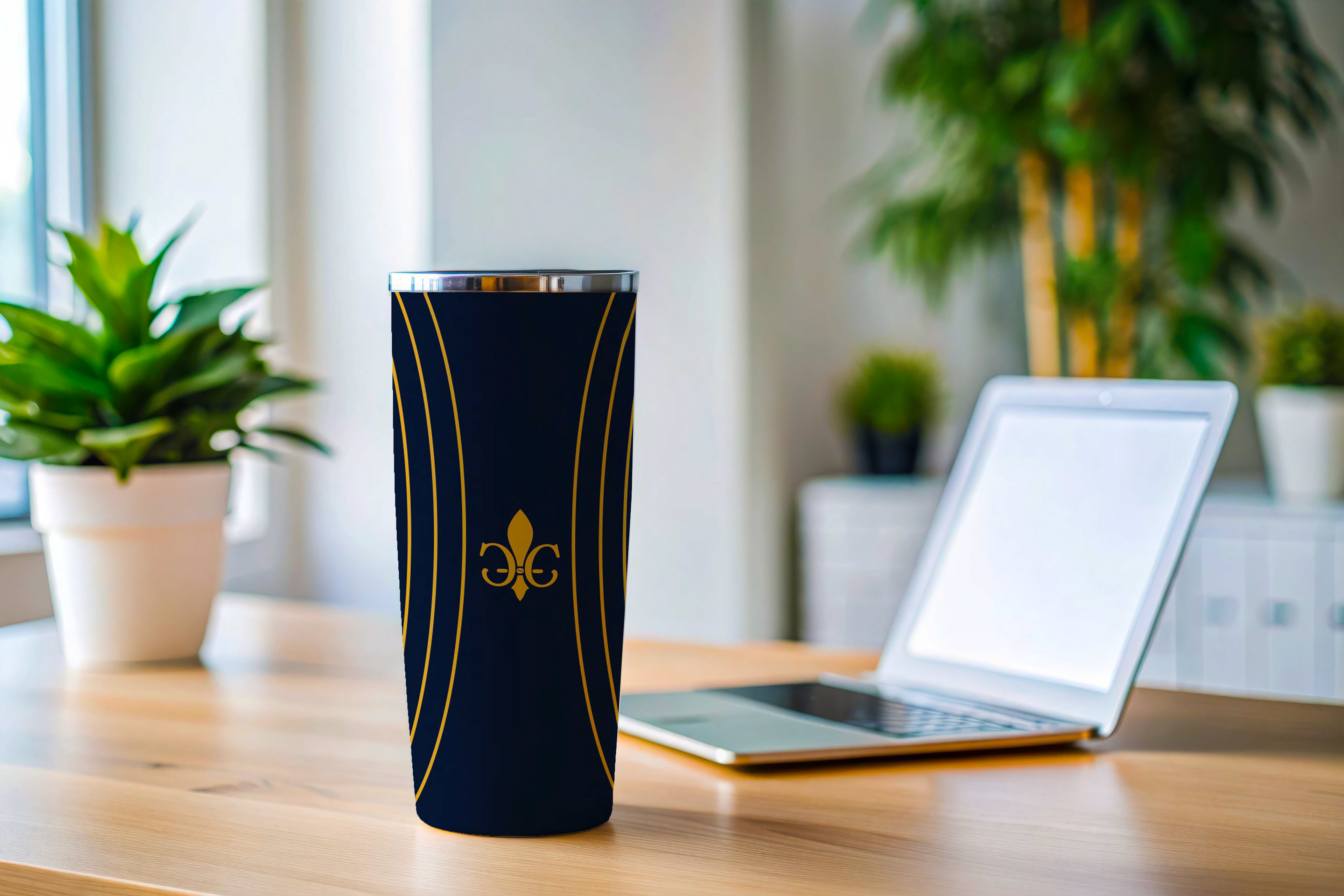
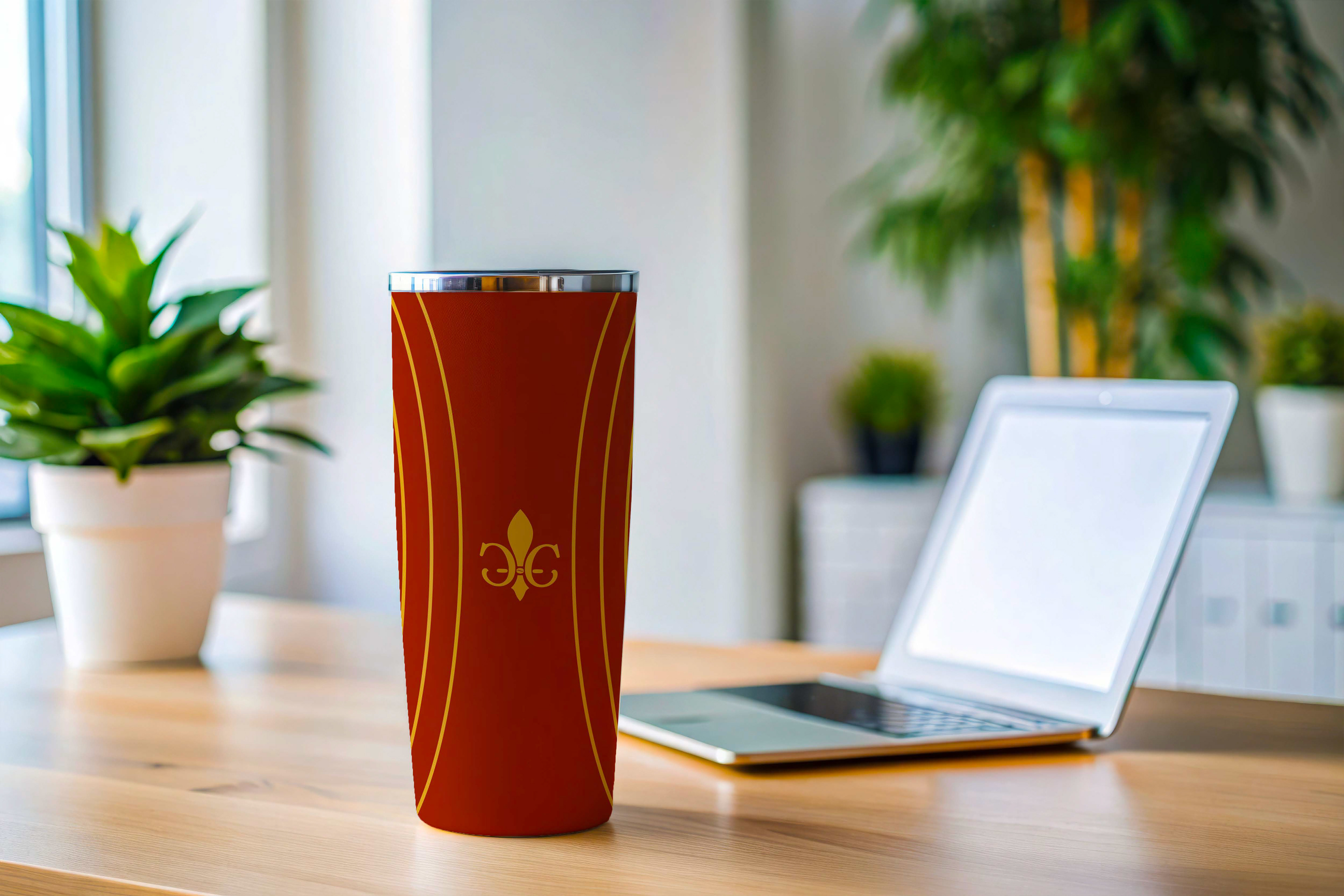
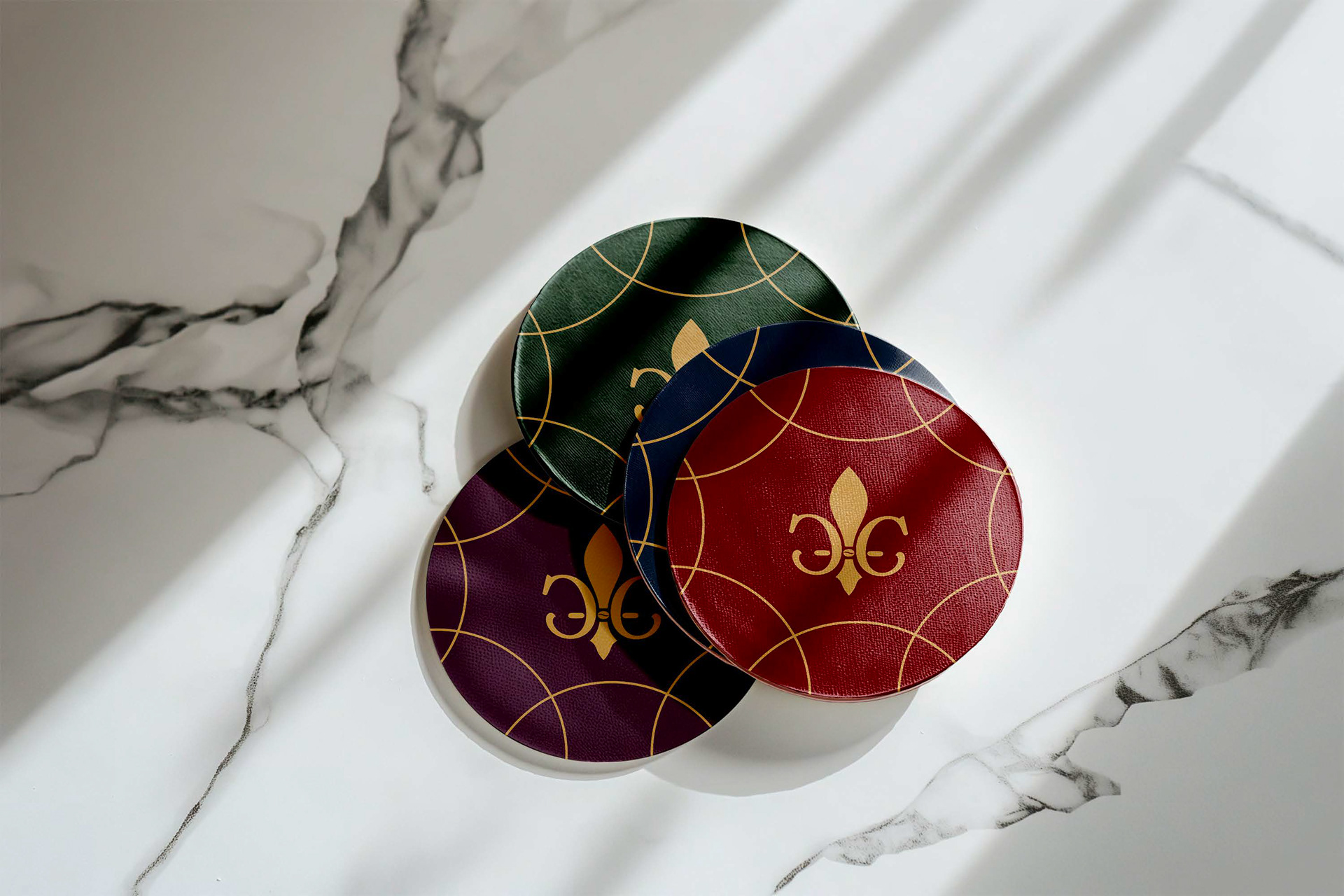
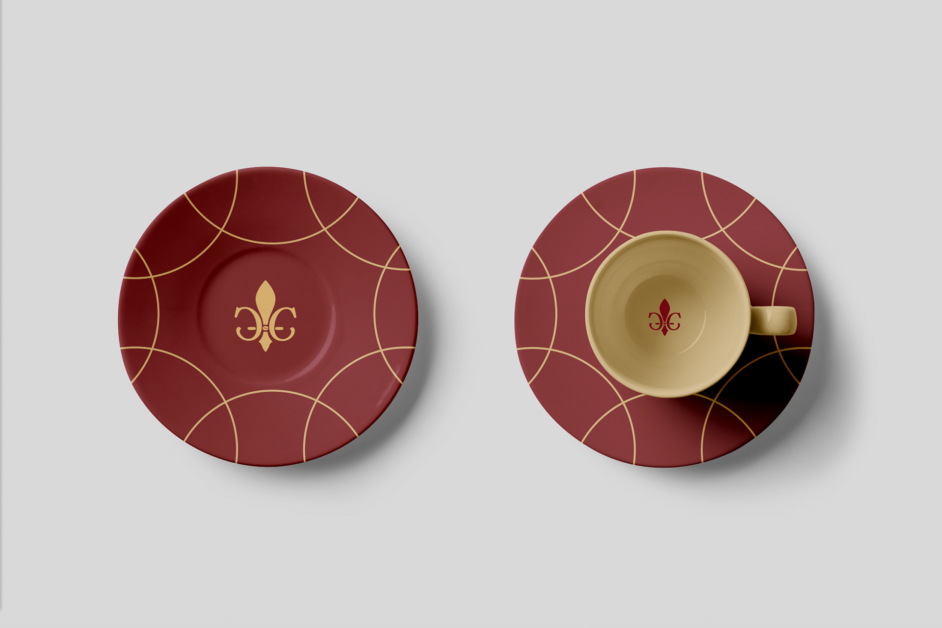
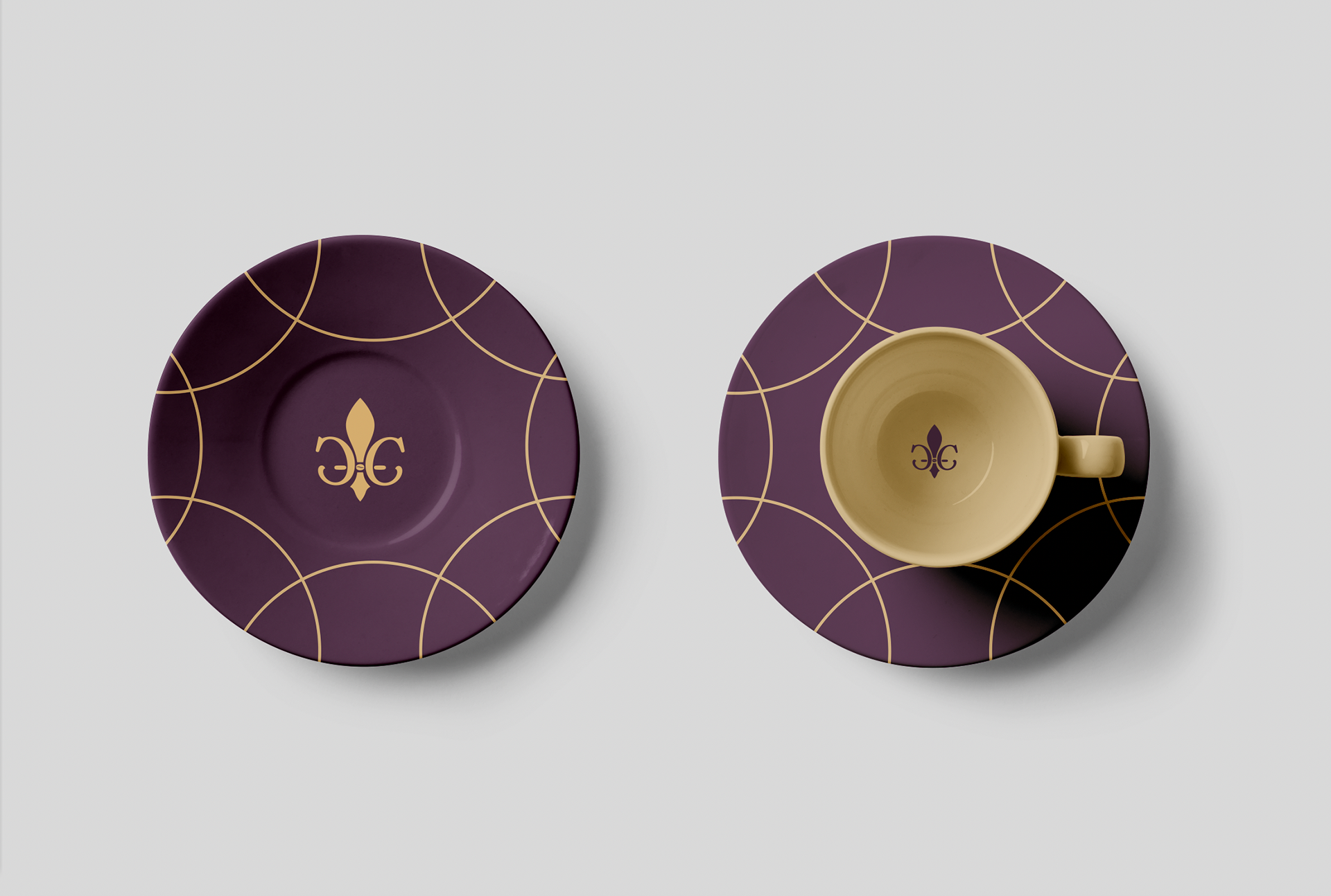

The idea was to elevate the brand and make it more elegant. I redesigned the logo as a fleur de lis in honor of the brand’s Lousiana roots, but I made the flourishes from back to back C’s for the brand name. The primary palette is composed of deep, rich tones with gold embellishments. The main imagery is a tone on tone pattern that corresponds to each flavor of coffee, and each of these has a shine to add to the elegant feel.